Watercolour 26″x29″ Matted and Framed
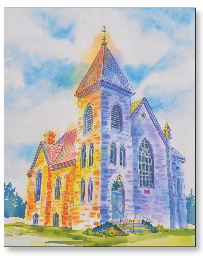
My artwork takes on a much more realistic approach when I am painting a subject that is an existing building. As in the case of my watercolour painting of the 200 year old church ‘Union Presbyterian Norval Ontario’, seen left. I came across this stunning piece of architecture while I was out for a scenic drive late one afternoon. I was passing this church just as the low sun was illuminating just one side of its exterior. I just had to stop and drive back to take some photos. Not only was this church already beautiful with its arched windows and flagstone walls, but that lighting on it was glorious!
I drew the image first in light pencil on my watercolour paper then drew in all my line work in permanent black ink. Now it was ready for my watercolour washes of paint. I always love to use ‘creative license’ when I paint meaning that I will deviate from the photo as much as I’d like to create interest and drama. To highlight the church wall that was glowing in the sun I used various mixes of warm aureolin yellow and mixed oranges by adding permanent rose. The church walls that are cast in shadow were embellished with washes of cool purples/blues, a mix of cobalt blue and permanent rose.
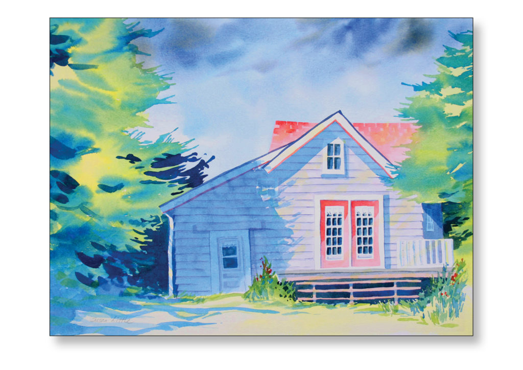
‘Summer Cottage’, seen at right, was a watercolour study of the brightness of the summer’s sunshine and the play of the cool shadows it created on the structure. I wanted the focus to be on the details of the cottage; the pattern of it’s siding, the cherry red windowed double doors and the fabulous red roof. The surrounding trees were kept loose and simple with some juicy contrasts in colours to suggest their boughs and their shadows.
This painting ‘In The Woods’, of a lakeside home seen at left, was such fun to imagine and create. I decided on a much more graphic illustrative style for this watercolour painting, starting it with a black ink line drawing using lots of interesting chunky shapes. I enjoyed designing the building’s location full of bushes and gardens. I wanted to dwarf the building with massive trees but keep the dwelling the focal point. This was achieved by painting it using warm reds and yellows which pop against the cool greens of the surrounding woods. It was fun to illustrate the calm lake water in stripes of blue while handling the windblown sky in much the same colours but with more organic shapes. Using architectural structures as my main subject matter in my paintings really gives me something to build on.
To see this finished original watercolour painting ‘Union Presbyterian Church, Norval Ontario‘, close up and for more of my paintings available for sale please go to my original watercolour and acrylic art galleries on this website. Many of my paintings are also available in 5″x7″ art cards.